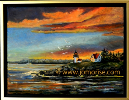
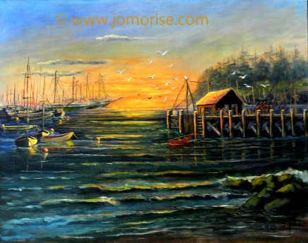
I did some major maintenance work on my websites:
www.jomorise.com
 |
| Is your sign distinctive? |
www.orisedesigns.com
All that behind the scene techie stuff.
NOTE: www.jomorise.com to be updated soon with new work.
Keep on the lookout.
__________________________
A little history about my websites:
Orise Designs originated in 1988.
I purchased the www.OriseDesigns.com domain and created the website around 1996.
- The hosting site was and still is DirectNic.com.
- NO advertising, ever! A clean site for just me.
Years later, I decided I needed a www.JoMOrise.com domain because I signed my artwork that way. Luckily, the domain name was available! Yes!
__________________________
Signage is important.
Choose a domain name - carefully.
Cutsie does not work...get over it.
 |
| Simplicity is clarity. |
If you have a business or hobby, and sign your work, keep it simple. Purchase a domain name that is YOU.
Purchase the domain www.janedoe.com if that is your name.
If janedoe.com is already floating out on the Internet, how about www.janedoe.artist.com?
More complicated than that discourages clients from seeking you out on the Internet.
If you sign your work differently, use that same signature. Perhaps your initials and last name, or just your last name, etc. Be creative.
For a professional appearance, you need:
1. a
logo - an easily recognized graphic or a photo
2. a font - fancy, easy to read (careful on the fancy...don't forget the cutsie advice)
3. NO all-caps - There are many beautiful fonts today. Use that for your name. A
serif or fancy font. Use simple blocky,
sans serif, for the rest of your wording.
4. especially NO Gothic-all-caps
Place logo and layout with fonts on all communication media. Stick to your design. Constant change confuses and discourages potential clients.
Where will you hang your sign? Does it "blend in" and disappear? Or is it distinctive? If so, how much space between it and another sign of distinction?
 |
| Does your signage blend in. . .too much? |
Look at the whole display and where displayed. What clientele do you want to attract?
Seek out examples in your area. Compare your signage with theirs. That includes the building sign, business cards, postcards, statements, receipts, banners, letterheads, packaging, and more.
If you are stuck, talk to a business owner. Compliment them on their choice of signage and ask how or who designed it for them. Who created the finished product. If you are computer and software savvy, you can do it yourself. A great many of us who are artistic can do a terrific job in creating our product, and stink at designing signage. Simplicity, clarity, easy to read. That is the aim.
Good luck.
 |
| Readable drive-by? Keep it simple big and bold. |
When I drive by, I hope to see your sign and be able to read it at 35 mph or more. Size and simplicity will do that for you.
Be recognized.
Communicate you are serious about your work, time, presentation, and your product. That is communicated by your sign.
"Smile in your mirror every day. :-)" J.M. Orise


